Information Graphics Package Project: COVID in America
As the pandemic hit America, the president who claimed that the virus was nothing but a flu, spurred a deadly infection that spread all across the country by allowing the airborne illness to go largely unchecked. The pandemic hit people-of-color hardest, highlighting the clear disparity in how ethnic groups are treated in America. None of us were prepared, just look at the consumer survey that was done— 65% of Americans were confident that there would be no change in their spending.
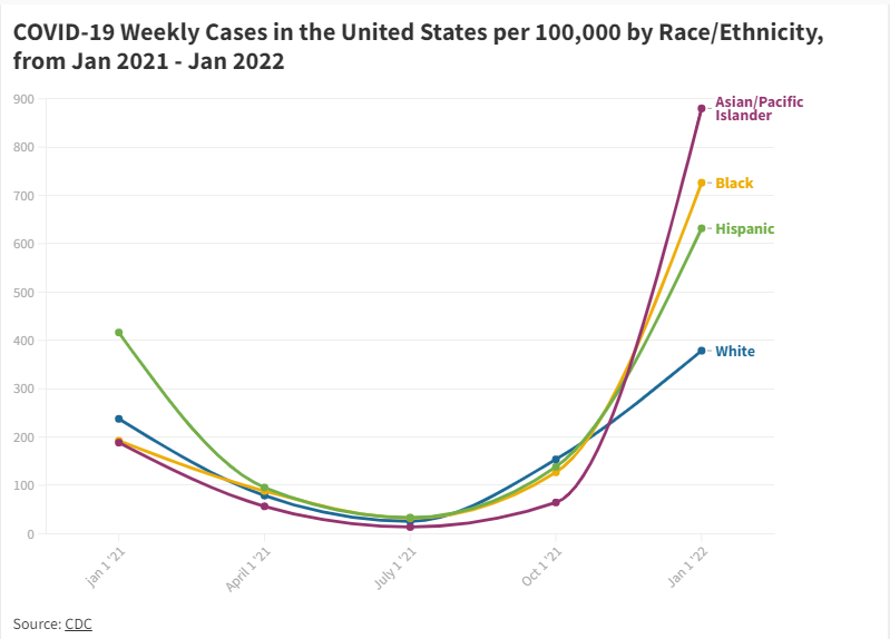
The graphs I used here also illustrate the racial disparity— the case data broken down by race shows that though Blacks and Hispanics make up only a minority of the population, they were bearing the brunt of the pandemic, while the number of Whites who were infected and hospitalized had been much lower. The reasons for this include a disparity in income, nature of work (white/blue collar work), housing security etc.
Apart from the disproportionate number of cases non-white racial groups had to suffer through, these trends continued exponnentially, which can be seen in the fever chart which tracks the cases through time from the beginning of the pandemic to the end of the presidency it sprang up from.
But first, here’s how COVID spreads:

Unfortunately these subsequent charts and graphs could not be embedded so images and links have been used instead
Like a canary in a coal mine, the first sign of American disaster is a decrease in spending habits during a time of flux— look at how Americans responded to their spending habits:

Source: Morning Consult
When the pandmic finally did rage on, these were those who were the most affected. Data is broken down by race and state over time.
POINT MAP LINK

Here are links to all copies of published graphics on Flourish:
https://public.flourish.studio/visualisation/10495030/
https://public.flourish.studio/visualisation/10491596/
https://public.flourish.studio/visualisation/10503089/
https://public.flourish.studio/visualisation/10495095/